Our Judge was Antoinette Blyth
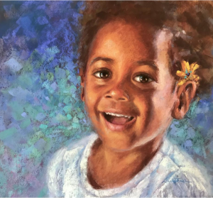
Best in Show
Linda Finch
Smile
Judges comments : This is a beautiful Pastel completed with skill and confidence. The work shows all the elements of art that make for a successful and appealing work. Composition has worked so well to create impact. The contrast of light and shade gives a vibrancy to the subject, whilst the choice of colours and textural marks of the background shows a confident approach that creates energy in the work. The use of the white top is quite important. This choice not only allows the colours used to impact the total painting but the white top balances the subtle lights of the eyes and teeth, allowing the touch of yellow to give most impact. There is excellent proportion and visual rhythm in the work and a positive use of space whilst creating an atmosphere of joy. This is a very well-planned painting that looks as though it was done with spontaneity and freedom. A work that is fresh and full of life. A beautiful child, beautifully depicted!
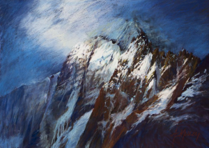
Best in Show Runner-up
Anne Melloy
Let There Be Light
Judges comments : Just as the title suggests, this work is a strong depiction of last light over the mountains of South Georgia. The minimal palette and the strong tonal contrast add to the atmosphere of the work. The way the marks depict snow melting from the cliffs creates movement and tells the story of a landscape that may have the element of danger to it. There is harmony in the selection of colour, whilst at the same time a variety of marks suggest lost and found edges. The element of space is well depicted using proportion and perspective and a foreboding atmosphere is created by the intense strength of the composition. This pastel is applied with skill and shows experience and confidence in the use of its approach to create maximum attention.
Margaret Lourey Award
Cathie Reynolds
Rhododendron Glory
Judge’s comments : As a foundation member of the Pastel Society Cathie, Margaret Lourey would be very pleased to see you win this award for your beautiful work. Your pastel of this Rhododendron is a unique study of the characteristics of the flower. You have used startling composition, colour harmony and texture to present your work. There is a balance and proportion that creates a visual movement in the flower and the skill in which you have worked with the pastel with light and dark tones shows patience and understanding of the subject. The repetition of colour serves to enhance the variety of petal shapes and the subtle shading of leaves from detail to impression is lovely. This is a very beautiful work, well done!
PSVA Award
Pierina Sannia
Italian Wedding in the 80s
Judge’s comments : This is a remarkable pastel. Quite unique and yet I can certainly relate to remembering a group of little girls dressed like this for a party! The composition is delightful. Not only do I see four individual personalities but also a variety of hand shapes, hair colour and folds of material. All showing tonal value appropriate to the subject. Your use of diagonal format enhances the composition. There is harmony in the soft choice of pastel colours but also variety in the garments themselves. The movement created by the expressions of the children give the viewer a sense that you would love to hear just what they are saying. The soft textural marks made to create the satin frocks show the light and shadow of the folds with skill. The detail on the socks and lace trim is excellent. This is a very interesting story played out in front of our eyes and what fun to know what intriguing words are being spoken that has one child absorbed and one totally oblivious to the situation.
Best of Awards
Best Waterscape
Lorraine Wigraft
Falls Creek
Judge’s comments : The use of space and contrast has been handled in the medium with skill and experience by Lorraine. The viewer is transported gently up Falls Creek through slight turmoil around foreground rocks using distinctive marks, to the subtle use of the medium to create a tranquil and calm effect by soft blended application. The use of a limited palette enhances the atmosphere however, the viewer finds soft light kissing tree -tops and brilliant light on the water, that subtly fade into shadows. The foliage is an example of how to use “green” in the landscape that is really “not” green but a combination of shades of colour that create the magic. There is a lovely mix of strokes that achieve lost and found edges that add to the viewer imagining standing just near the edge of the water to view the scene. At the same time, the foreground has strength of movement that intrigues the viewer to search for more. A lovely work Lorraine!
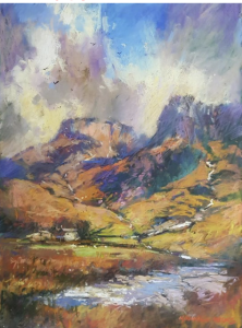
Best Landscape
Max Wilks
Scottish Highlands
Judge’s comments : This work by Max immediately attracts by its uniqueness of a known subject. Creativity is expressed in the handling of the medium whilst understanding the elements of art; composition, balance, harmony, contrast, variety, and use of space. The application of both soft and hard edges gives a textural finish that enhances the work. The use of soft confident strokes in the clouds give movement and atmosphere to the scene and the proportion of the buildings add to the surrounds, reinforcing the immense space of the area. The story that the viewer may interpret form this work is one of the majesty of the Scottish landscape and the appealing atmosphere of that day.
Best Animal/Wildlife
Gayle Newcombe
Four Little Ducks Went Out One Day
Judge’s comments : It is obvious by all your work in this section Gayle, that you have a deep love of animals and wildlife, and when you love painting a particular interest, that love shows in the work. This pastel of the mother duck and little ones stands out to me for a variety of reasons. You have not only shown skill with the technique of handling the pastel but it is the use of visual rhythm, perspective, movement and scale that is also obvious. The unusual composition with mother duck looking out of the painting, on guard, instead of looking in, attracts attention. The use of tone and light on the focus duckling is most effective, and the abstract minimal background creates a balance with the detail of the birds. There is a lovely balance with the cool tone of the grass and the warmth of tone in the ducklings. The story line asks the viewer to interpret what is going on and that communication between artist and observer makes for a very interesting work.
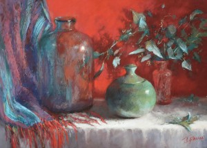
Best Still Life/Floral/Interior
Jennifer Paull
Colour Harmony
Judge’s comments : When artists’ wish to paint florals or still life paintings there is always the question of how to present this natural beauty in a different way that may attract the viewer. This work stood out for its uniqueness. The craftmanship used here shows your technique with the pastel and an understanding of the basic elements of art. The use of composition, colour, space form and texture is evident. By using the light source shining from the right, you have achieved one of the most important principles of contrast. The light hitting objects creates the darks, and that factor gives impact to your work and creates beautiful shadows on the cloth. The lost and found areas of the material and leaves visible through the glass is delightful, with that, the subtle change of colour from light to dark keeps the work in harmony. There is both unity and variety in the work and that keeps the viewer interested. The limited palette and minimal need for detail tells the story simply and the result is excellent. Well done!
Best Portrait/Figurative
Heather Peberdy
Edie Makes a Wish
Judge’s comments : It is most refreshing to see a portrait handled in a creative way with a new aspect of uniqueness. The way you have presented this work Heather, shows skill and confidence in handling the medium. The effective use of composition and space attracts initially by its simplicity. Within this however, there is a subtle use of colour tone, soft and hard edges, warm and cool pastel and exciting movement. We feel the movement of Edie’s breath floating away the seeds and see the little one imagining her wish. The use of minimal palette for the child together with the clever play of light on her arm and through her hair adds to the attraction of the figure and the innocence of the little girl. The application of the folds of dress, her pale skin tone and her hands are well done. There is variety, unity and good proportion in the work. The story of course is most appealing to the viewer and captures our attention. Perhaps we stand looking at the work wondering what is going to happen next?


